Product designers are delusional. They have to be a little bit crazy. Because they need to achieve something that’s almost impossible. They attempt to create a brand new product that people will love.
When I say almost impossible, I mean that 95% of innovations fail. According to Clay Christensen, only 5% of the over 30,000 new products launched every year succeed.
Before we solve the impossible, let’s ask why is launching a new product so hard.
Endowment Effect

Customers love the status quo. They covet the things they already own. That’s called loss aversion. They see more pains than gains in new products.
Moreover, the problem is that inventors and designers love their new thing too. This problem leads to a stalemate, otherwise called the Endowment Effect. Both the customer and designer love what they have and rarely can meet in the middle. The Segway failure is a classic example of the Endowment Effect.
Let’s look at some research that highlights this effect. The “Anomalies” study by Kahneman, Knetsch and Thaler validated how people put a higher value on things they own. You can download the study here.
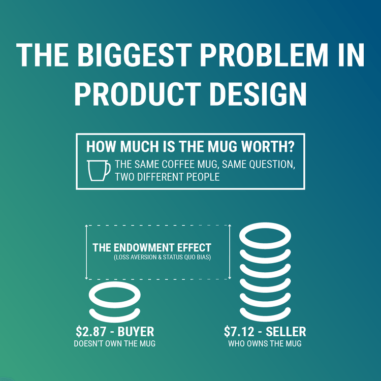
The study is beautifully simple and uses a coffee mug to demonstrate the Endowment Effect. When customers owned a coffee mug, they priced its value much higher than those who didn’t.
When asked to measure the financial value of the coffee mug, those who owned it said the cup was worth $7.12 on average. Conversely, those who didn’t own the mug valued it at an average of $2.87. It was a significant difference in value for the same cup. The only thing that changed was the state of ownership.
So how do we change user behaviour? How do we successfully introduce new products and services?
The Fogg Behaviour Model
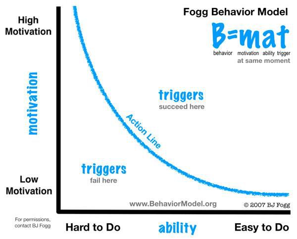
Now move from Princeton to Stanford. The answer lays with Dr BJ Fogg. He directs the Persuasive Tech Lab at Stanford University. He designed the antidote to the Endowment Effect. He created The Fogg Behaviour Model.

Fogg’s model says users will change their behaviours and adopt new products if they have three things:
-
Motivation
-
Ability
-
Prompt
Understanding user motivation
Users have three groups of motivators:
-
Sensation: pleasure and pain
-
Anticipation: hope and fear
-
Belonging: acceptance and rejection
The pathway to ability
There are three ways to balance a user’s ability to a task:
-
Training
-
Provide a resource
-
Make the task or action smaller
The power of prompts
There are numerous reminders for behaviours and actions; cue, trigger, call to action, signal, spark, request, notifications.
Example
Let’s take a simple example from Fogg of answering your phone. The phone rings, and you don’t answer it. Here’s how the Fogg model decodes the event.
- The prompt: ringing sound and screen activation.
- The ability: you’re in the shower, so you don’t have the ‘ability’ to answer.
- The motivation: you’re able to answer, but don’t take the call because you don’t want (not motivated) to speak with that particular person.
When you optimise a product experience with the Fogg model, several things occur. Users are highly motivated, they have the necessary skills to use the product, and reminders appear at just the right time. An extreme case of the model working is Facebook. They have used this model so well it leads users to feel addicted to their products.
I know this sounds daunting to match the behavioural design of tech titans. Just start with baby steps. Build little habits into your products and ask your user to complete small tasks. From there you can build momentum and confidence in your users. That, no doubt, will lead you towards success.


How to Find a Contagious Story in Your New Product
Posted at 12:35h, 05 August[…] handy because all product designers live in a reality distortion field. It’s called the Endowment Effect. The good ones step into reality and have deep empathy for their […]